After more than twenty years in the market, I can say this clearly: reviewing real portfolios teaches more than reading interviews or investment books. Allocations reveal discipline. Position sizes reveal conviction. Drawdowns reveal character.
If you want to study real portfolios in detail, you can explore all tracked investors here: https://www.marketlog.com/investors.
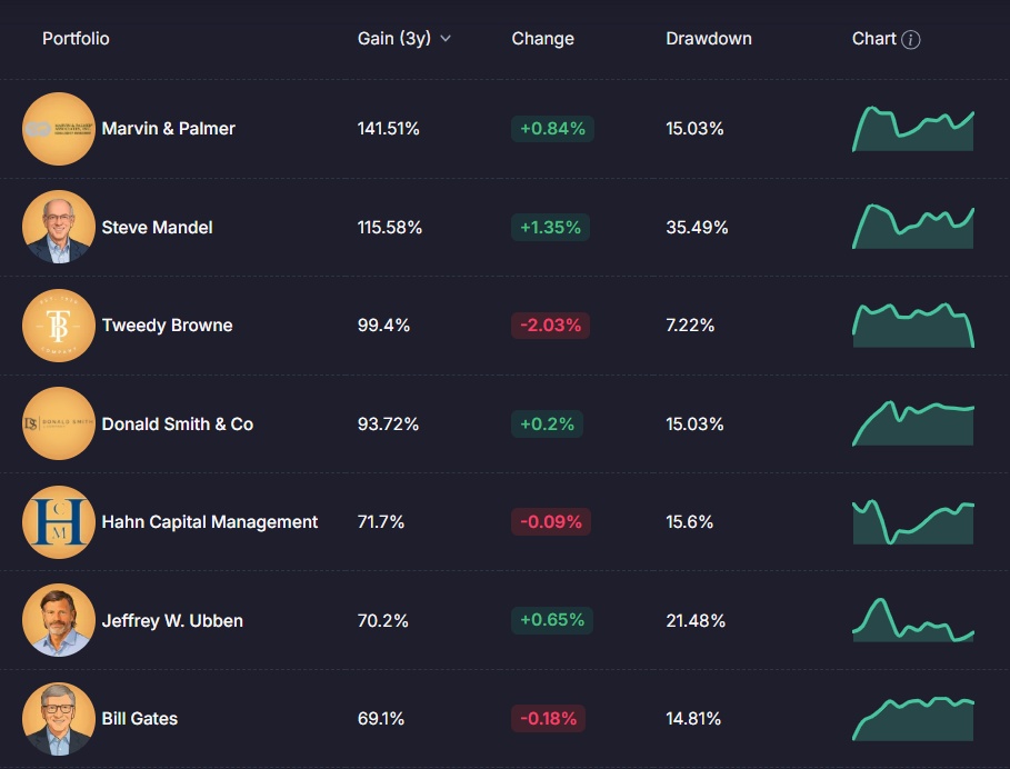
Below are three well-known examples, followed by a practical overview of what Marketlog lets users track and review on each portfolio page.
Bill Gates — Concentration and Structural Allocation
Portfolio: https://www.marketlog.com/investors/5bb112423ec045b6
When reviewing the Bill & Melinda Gates Foundation Trust portfolio, concentration stands out immediately. Berkshire Hathaway represents roughly 25% of the portfolio. Waste Management and Canadian National Railway also carry meaningful weight. This is not a scattered allocation. It reflects a clear hierarchy of positions.

The page also shows the scale of the portfolio and the sources of return. Equity value is displayed (around $37.74B in the screenshot), alongside total profit (around $54.82B) and dividends over time (over $4.29B). These figures matter because they show how capital compounds through both appreciation and income.
Drawdown is presented next to return. That context is essential. Returns without drawdown data are incomplete. Risk must be measured alongside performance. From experience, this is what serious investors review first: how much risk was taken to achieve the result.
Warren Buffett — Stability and Long Holding Periods
Portfolio: https://www.marketlog.com/investors/ee932a153c892745
Buffett’s structure reflects long-term ownership. Large allocations to durable businesses. Limited turnover. High conviction in core holdings.
On Marketlog, this type of portfolio becomes easy to evaluate because the page provides multi-year performance views, plus a breakdown of profit into realized and unrealized components. That separation matters. It helps you see whether results came from long-held winners or from frequent recycling of positions.

The time-based growth view is also important. It shows whether returns were steady or dependent on a short, favorable stretch. Serious investors study performance across cycles, not just headline numbers.
John Paulson — Macro Positioning and Allocation Shifts
Portfolio: https://www.marketlog.com/investors/4c838867d9084f66
Paulson’s portfolio reflects a more event-driven style. Allocations can shift when macro conditions change. When you review this kind of portfolio, the key is to track how exposure evolves over time, and whether performance depends on a narrow set of themes.

Marketlog supports this by showing holdings distribution by tickers, market cap, industry, and sector. It also shows gainers and losers inside the portfolio, which helps identify the true return drivers. Many portfolios look diversified on the surface but rely on a small number of contributors.
What Marketlog Lets You Track on a Portfolio Page
Marketlog is useful because it does not stop at a holdings list. Users can open a portfolio and get a detailed view of performance, risk, positions, and income, with the ability to review the same metrics across different timeframes.
Performance metrics with context
The screenshots show a clear set of portfolio-level metrics, including total gain, monthly and yearly performance, win rate, and drawdown, alongside equity value, profit, and dividend totals. In practice, this prevents the common mistake of judging a portfolio by return alone. A high win rate means little if drawdowns are large or if performance is unstable.
Charts that separate growth from risk
Users can switch between Growth, Equity, Profit, and Drawdown views. This matters because a smooth equity curve can hide periods of stress. Drawdown reveals the cost of staying invested during weak stretches, which is where many investors lose discipline.
Detailed holdings data
Holdings are displayed with practical fields: quantity, cost basis, current value, dollar profit, percentage gain, and daily change. That level of detail supports real portfolio review. It lets you see which positions carry the portfolio, which lag, and how concentrated the risk really is.
Dividend tracking and dividend contribution
Dividend information is presented as a schedule and as totals over time. Users can review upcoming dividend events, dividend totals by month, and the contribution by individual holdings. For long-term investors, dividends are not a side detail. They are a core component of total return and portfolio stability.
Forecasting as a scenario tool
The forecast view allows users to model portfolio growth over a chosen number of years using defined growth assumptions and starting equity. Used responsibly, this is a planning tool. It helps you understand the long-term impact of steady compounding versus aggressive assumptions. It should not be treated as a prediction.
Monthly and yearly return breakdown
Marketlog also shows returns by month and by year. This matters because average annual return hides volatility. A portfolio can look stable on an annual basis while experiencing wide swings in shorter periods. Understanding those swings helps investors assess whether their own risk tolerance matches the structure they are studying.
Why This Matters for Marketlog Users
Studying portfolios like Bill Gates’, Warren Buffett’s, and John Paulson’s is useful. It becomes more valuable when you compare those structures with your own. Allocation is not a statement. It is a set of decisions recorded over time.
Over the years, I have seen investors with excellent stock selection fail because their allocation lacked discipline. I have also seen average stock pickers build stable results through controlled position sizing and consistent review.
A portfolio page on Marketlog is not just a list of holdings. It is a record of decisions. It shows exposure, concentration, income, volatility, and behavior across time. Markets will continue to cycle. There will be strong years and difficult ones. Reviewing portfolios with clear data — and reviewing your own with the same discipline — remains one of the few practices fully within an investor’s control. That is where long-term clarity begins.