


Asset allocation remains one of the most fundamental concepts in portfolio management. Yet, many investors glance at their allocation charts without fully grasping the insights these visual tools offer. An allocation chart is more than a colorful pie or bar graph; it is a concise representation of how capital is distributed across various asset classes, sectors, and individual holdings. Understanding what these charts reveal can significantly enhance decision-making and risk management, providing a clearer pathway to long-term investment success.
The Role of Asset Allocation in Portfolio Management
Asset allocation serves as the backbone of any investment strategy. It defines the proportion of capital invested in different asset categories such as equities, bonds, cash, and alternative investments. This distribution balances risk and return by diversifying exposure across assets that typically respond differently to market conditions, economic cycles, and geopolitical events.
Without a clear allocation strategy, portfolios risk becoming overweight in certain areas, increasing vulnerability to market swings and unexpected downturns. The allocation chart provides a snapshot of this distribution, helping investors maintain alignment with their long-term objectives and risk tolerance. By regularly reviewing these charts, investors can ensure their portfolios remain resilient and positioned to capitalize on opportunities.
Reading Between the Lines of an Allocation Chart
At first glance, an allocation chart might seem straightforward: it shows percentages allocated to various assets. However, a deeper analysis uncovers important signals about portfolio health and potential blind spots that might otherwise go unnoticed.
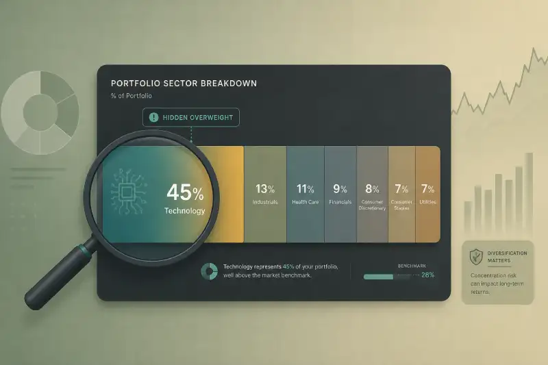
- Concentration Risk: Large slices representing a single sector, asset class, or security highlight concentration risk. While concentrated positions can yield high returns, they also increase exposure to idiosyncratic risks, those specific to a particular company or sector, that may not be mitigated by broader market trends.
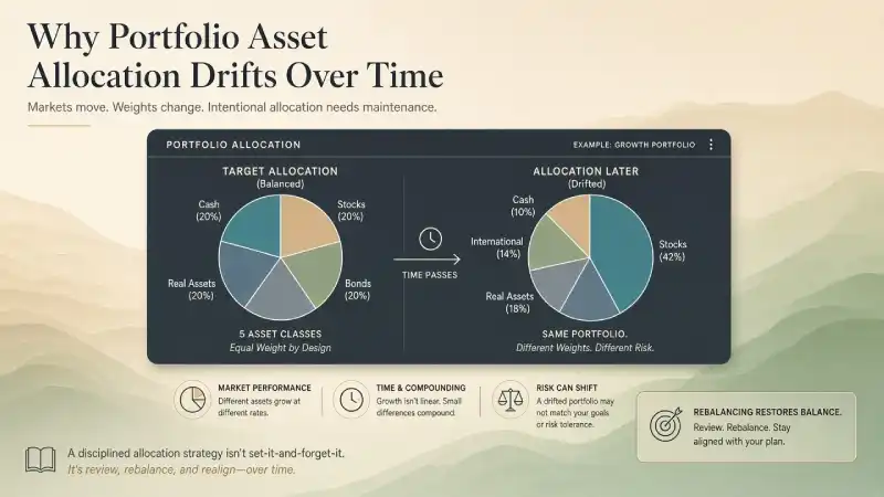
- Over- or Underexposure: Comparing the allocation chart against a target asset mix can reveal over- or underweight positions. These misalignments may indicate the need for rebalancing to stay consistent with investment goals and risk profiles. For example, an overweight in equities relative to bonds may increase volatility, while an underweight in international assets could reduce diversification benefits.
- Market Drift: Asset price movements can cause allocation drift over time. Even a carefully designed initial allocation can shift significantly due to market performance, dividends, or other factors, underscoring the importance of periodic reviews and adjustments to maintain the intended risk/return balance.
Common Pitfalls Revealed by Allocation Charts
Investors often misinterpret allocation charts due to cognitive biases or a lack of context. For example, a portfolio heavily weighted in technology stocks might appear well diversified if viewed only by sector but may actually be concentrated in a narrow group of correlated securities that tend to move together, increasing systemic risk.
Similarly, a high allocation to international equities might mask underlying currency risk or geopolitical exposure that can influence returns independently of market movements. Understanding these nuances is essential to avoid false confidence in perceived diversification.
Another common mistake is ignoring the impact of reinvested dividends on allocation. Dividend reinvestments can subtly shift the portfolio's composition over time, emphasizing certain holdings and potentially altering risk profiles. Monitoring not just holdings but also sources of returns enhances portfolio management. For a deeper exploration of this effect, see The Silent Power of Reinvested Dividends.
The Importance of Regular Portfolio Tracking
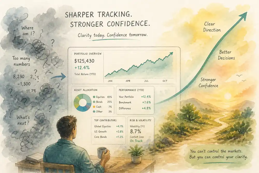
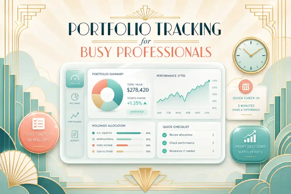
Effective portfolio tracking is essential to maintaining an allocation that aligns with investment objectives. In today’s fast-moving markets, technology solutions have made it easier than ever to monitor portfolios in real time. Sophisticated tools that provide dynamic allocation charts, up-to-date performance metrics, and customizable alerts enable investors to quickly identify when their portfolios deviate from targets or when rebalancing opportunities arise.
For those managing complex portfolios or multiple accounts, leveraging advanced portfolio tracking platforms can dramatically improve oversight and decision-making. These platforms often integrate features such as tax lot tracking, cost basis calculations, sector and geographic analysis, and real-time market data, all critical components for a holistic view of portfolio health and performance.
Rebalancing: Acting on What the Chart Reveals
Once an allocation chart signals drift or imbalance, disciplined rebalancing is the logical next step. This process involves buying or selling assets to restore the original or revised allocation targets. Rebalancing helps manage risk by preventing unintended overexposure to certain sectors or asset classes, locking in gains from outperforming areas, and maintaining strategic discipline in the face of market volatility.
However, rebalancing is not a mechanical exercise. It requires consideration of transaction costs, tax implications, and prevailing market conditions. Investors should integrate insights from their allocation charts with broader portfolio objectives, personal financial goals, and market outlooks to determine the optimal timing and extent of rebalancing activities.
Linking Allocation Insights to Broader Portfolio Metrics
Allocation charts should be interpreted alongside other portfolio metrics for a comprehensive assessment. For example, understanding the cost basis of holdings provides clarity on realized versus unrealized gains, a distinction crucial for tax planning and managing capital gains exposure. The article What 'Cost Basis' Really Means in Your Portfolio offers valuable perspectives on this important topic.
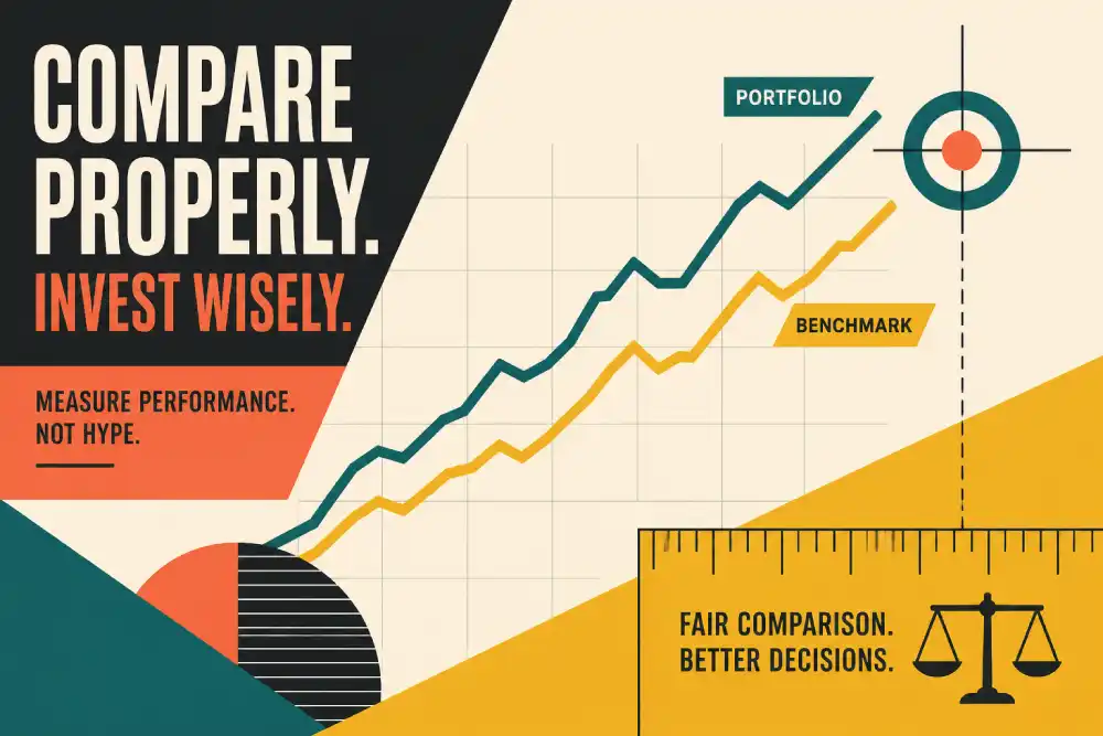
Moreover, investors frequently misread their returns by focusing solely on nominal gains without adjusting for risk, fees, or comparing to appropriate benchmarks. Allocation charts help contextualize returns by revealing the portfolio’s risk exposures and diversification levels. This broader understanding assists investors in evaluating whether returns are commensurate with the risks taken. For further insights, see Why Most Investors Misread Their Own Returns.
Practical Steps to Utilize Allocation Charts Effectively
- Define Clear Allocation Targets: Establish allocation percentages consistent with investment goals, risk tolerance, and investment horizon. These targets serve as a benchmark for monitoring and rebalancing.
- Use Reliable Tools: Employ robust portfolio tracking platforms that provide real-time, accurate allocation charts and integrate seamlessly with data sources. Reliable data is critical for making informed decisions.
- Review Regularly: Schedule periodic reviews—quarterly, semi-annually, or annually—to detect allocation drift and emerging risks. Frequency should align with portfolio complexity and market volatility.
- Integrate Other Data: Combine allocation insights with cost basis information, dividend reinvestment impacts, and thorough return analysis to form a comprehensive understanding of portfolio dynamics.
- Implement Disciplined Rebalancing: Adjust holdings thoughtfully, considering tax consequences, transaction costs, and prevailing market conditions. Avoid reactionary moves driven by short-term market noise.
Conclusion
An allocation chart is a powerful diagnostic tool that reveals the underlying structure and risk profile of a portfolio. Investors who learn to interpret these charts effectively gain a significant advantage in portfolio management. They can identify concentration risks, monitor market drift, and make informed rebalancing decisions that align with their financial goals.
In today’s complex investment environment, combining allocation insights with comprehensive portfolio tracking and disciplined analysis enhances the ability to navigate markets confidently. This integrated approach supports proactive risk management and positions investors to capitalize on opportunities while managing downside risks.
For those managing their holdings actively, keeping a close eye on allocation charts is a critical step toward achieving long-term investment success. Those interested in exploring superior portfolio tracking capabilities can visit my portfolio to experience tools designed to deliver clear allocation insights and performance transparency. Additionally, investors focused on equities should consider reviewing allocation alongside a detailed analysis of stocks to further optimize portfolio outcomes and enhance diversification strategies.